Data stories
Each of these is one finding in public data, published with the chart that shows it, the indicator it came from, and the exact rows as a downloadable CSV. Every figure in the text is recomputed from those rows before the page goes up, and where a measure cannot answer the obvious follow-up question, the page says so instead of guessing.
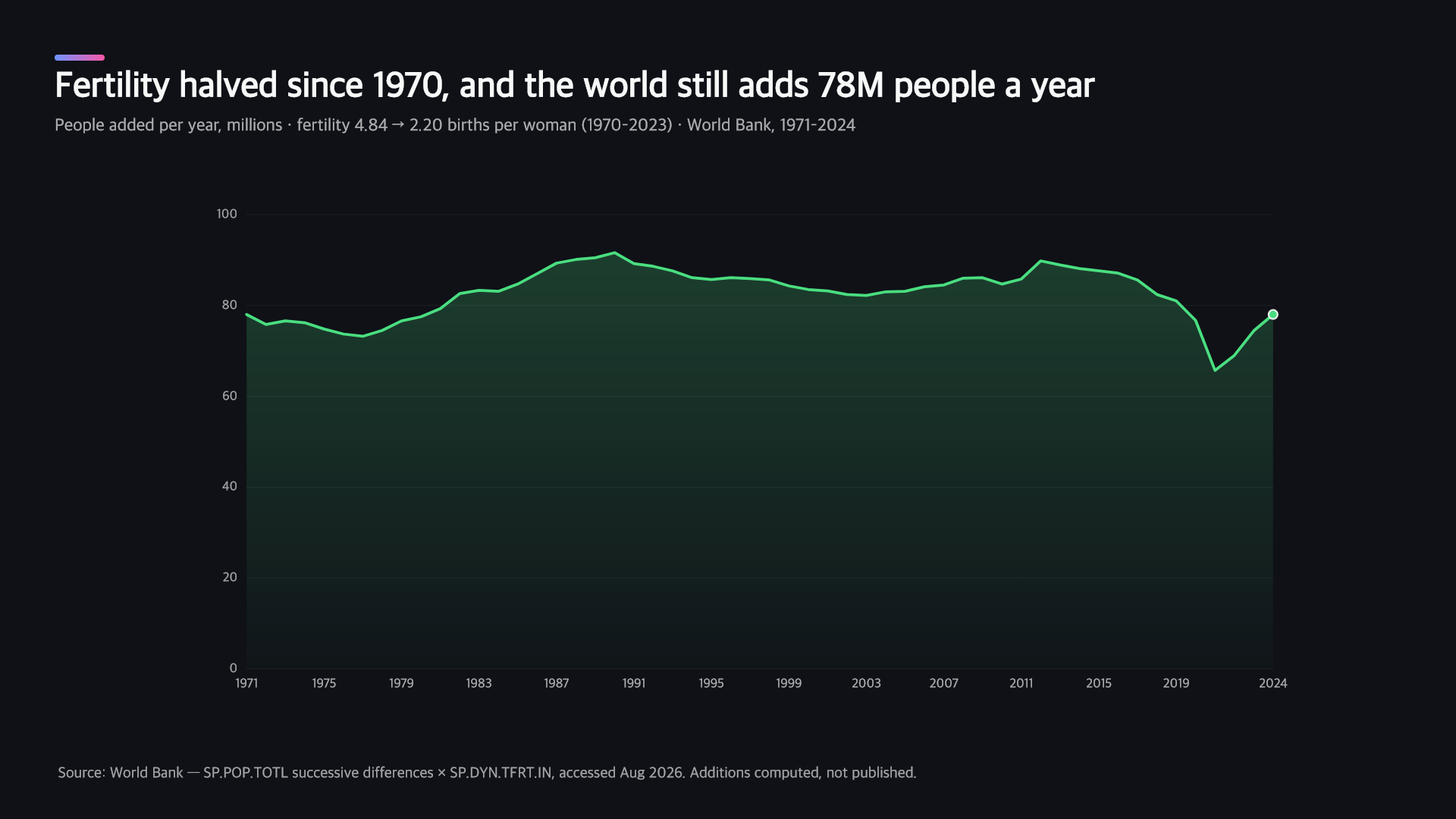
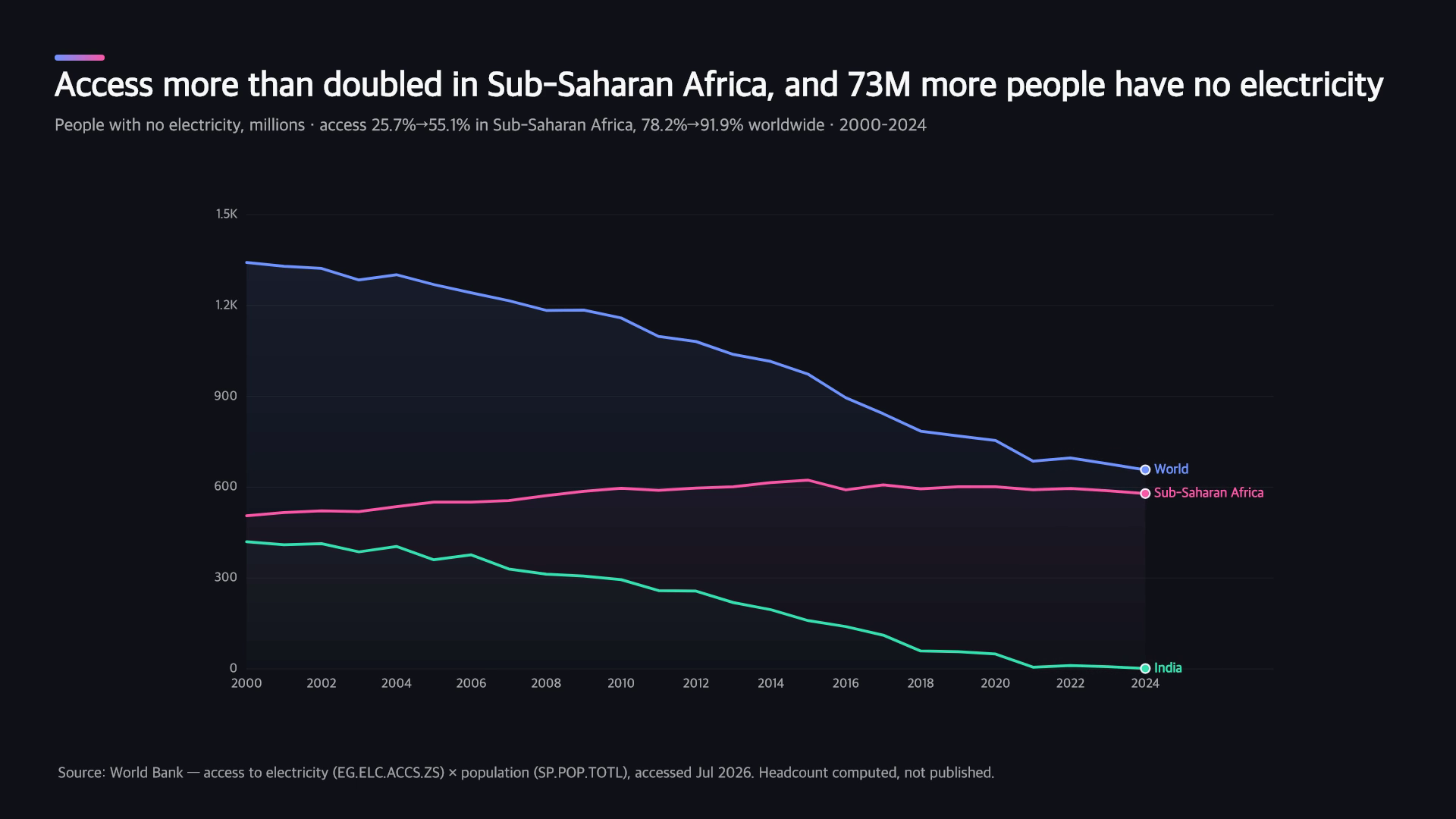
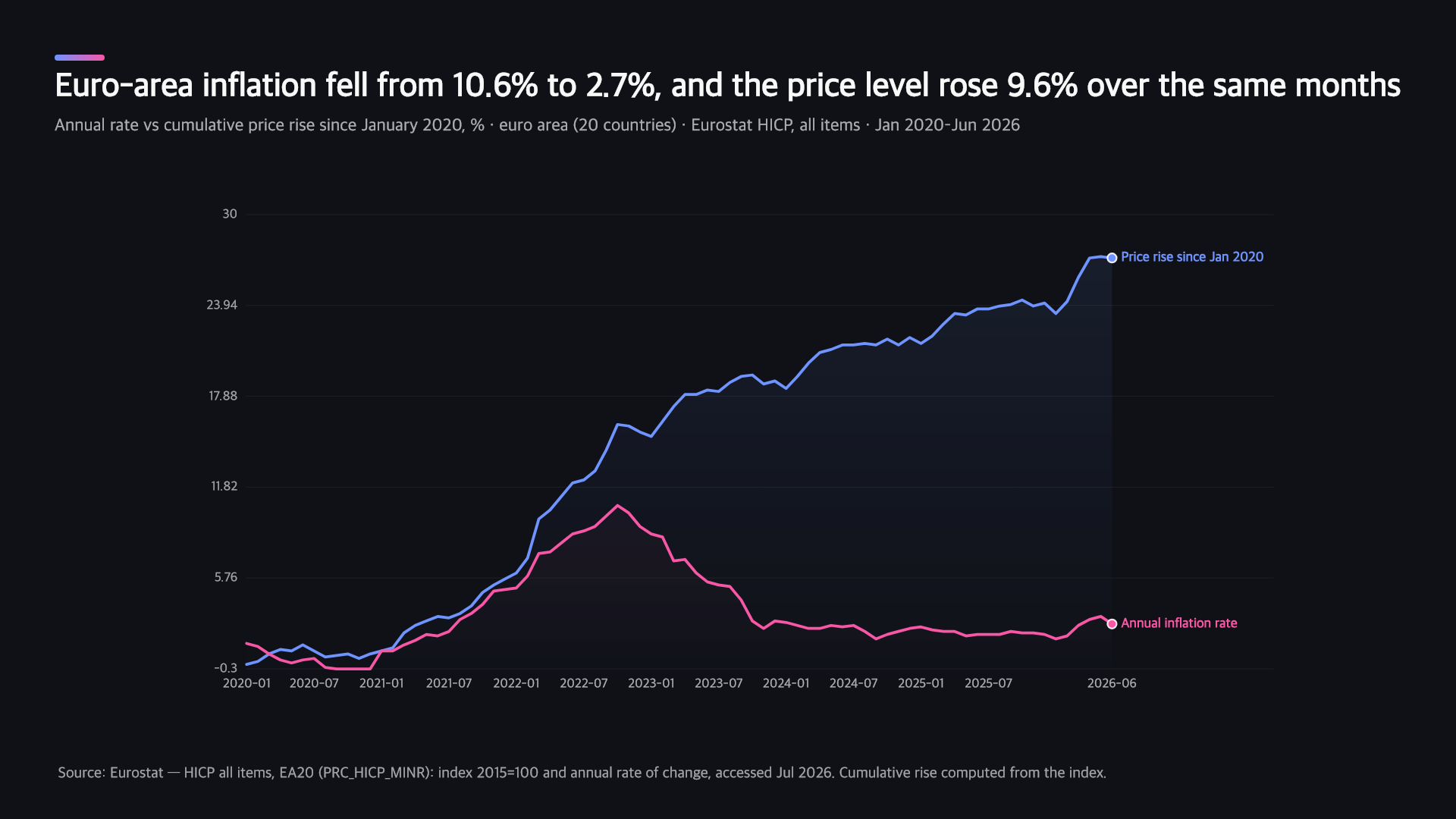
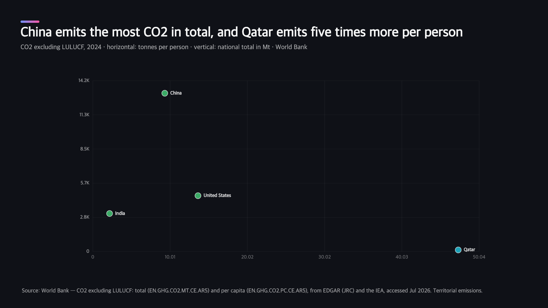
How are these made?
The same way you would make one. The figures are pulled from a public source through the same adapters the product uses, the chart is rendered by the same engine, and every claim is recomputed from the rows before the page goes up. Nothing is hand-drawn or hand-typed, which is why the CSV on each page is the file the chart was actually built from rather than an export made afterwards.
What makes something worth publishing?
Four questions, and a candidate has to pass all four. Is there a real finding, or just a chart? Would someone who has never heard of Furlen share it? Is the source citable and current? And can we say something the source itself does not already say — because restating a published table adds nothing. A week with no candidate that clears the bar is a week with no story. A thin page would cost more than a missing one: helpful-content grading looks at a domain as a whole, so weak pages pull the good ones down with them.
What happens when the data cannot answer the question?
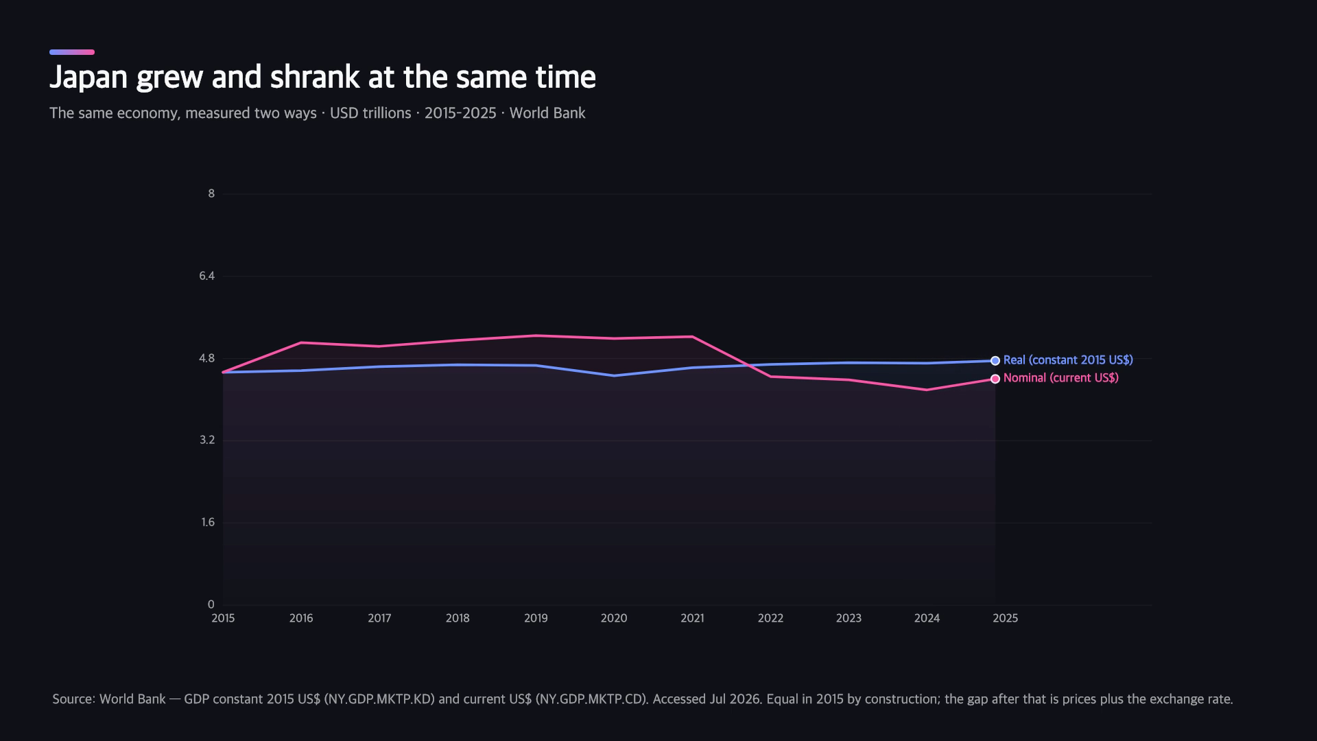
The page says so. The first story here shows Japan’s GDP falling by about a fifth in dollar terms, and the obvious next sentence is “because the yen weakened” — but Furlen cannot source exchange rates, so that sentence is not there. Naming the limit is more useful than filling it with something plausible, and on a product whose whole claim is that it does not state what it cannot check, the data stories are the last place to start guessing.
Make one from your own data
Upload a spreadsheet, or ask for a public dataset by name. The verification that runs on these pages is the same one that runs on yours.